Tue, May. 13 2014
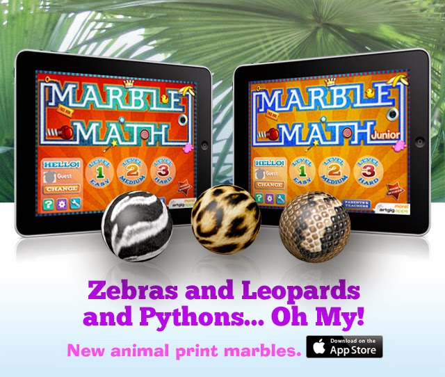
We've been so deeply entrenched in the final stages of production on our latest kids app, Drive About: Number Neighborhood, that I almost forgot to mention a nice update to the award-winning Marble Math family.
We're set to release new Marble Math and Marble Math Junior app versions this week, adding new marbles to both games.
Now you can earn zebra, leopard, chameleon, parrot, python, peacock, cow and butterfly marbles.
Keep your eye out for the updates in the App Store this Thursday.
And stay tuned for a special Marble Math promotion this App Friday.
Mon, May. 5 2014
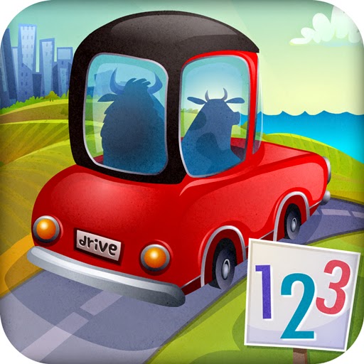
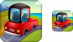
A big and beautiful Drive About: Number Neighborhood app icon
You voted and we listened.
It is with great pleasure that I now introduce the winner of the Drive About: Number Neighborhood app icon challenge.
You also told us we absolutely had to find a way to get some numbers into the art so we made some adjustments.
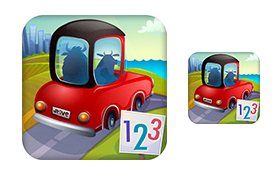
Drive icon at standard viewing sizes
We really like icon and we're grateful for your help.
Today, we're making some last minute tweaks before shipping the game for beta testing.
If all goes well, we'll release the app in about a month.
You can sign up for our newsletter and we'll keep you informed as we get closer to launch.
Wed, Apr. 30 2014
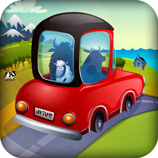
We really liked this icon but the sheep looks like a hostage.
We've reached a critical decision point in the app design process and we need your help.
It's a graphic designers ultimate challenge - how to sell your app in a single image that may be reduced to something that is smaller than a postage stamp, in a sea of miniature postage stamps.

When reduced, the sheep looks less scared but he also looks less like a sheep - too many details are lost.
We've got a lot to say about our new early learning app, Drive About: Number Neighborhood, but we can't say it all in the icon - that's what your app description and screenshots are for.

Option 1A has a rolling country feel
1B adds a city vibe in place of the mountains
Do we focus on the driving, and emphasize the quality of the app in a rich illustration (1A and B)?

Option 2A - sometimes less is more
Or, do we simplify and go with a strong profile and underline the math (2A and B)?

2B - color makes the numbers more playful - but harder to read at a smaller size
Which icon would entice you to find out more about the app?
We want to make a decision in the next couple of days so let us know what you think and we'll share the winner with you next week.